PhotoGallery Server Control
The PhotoGallery server control helps users and community groups track and manage images. They can organize the images in any number of taxonomy categories. For example, a user might have the following organization.
Science
- Biology
- Animals
- Mammals
- Lions
- Bears
Once a user uploads an image to the his Photo Gallery, site visitors can navigate through its taxonomy and view the image.
This section also contains the following topics.
Adding Photos to a Photo Gallery
Changing a Photo’s Title or Description
Changing a Photo’s Title or Description
Saving a Photo to User’s Local System
Allowing Community Group Members to Work with Folders
PhotoGallery Server Control Properties
Adding Categories
Users can add categories to their photo gallery to help them sort their photos. They can also use categories to identify the types of users who can view the photos. For example, one category of photos may be private, while another may be shared with all of your colleagues.
To add categories, follow these steps.
1. On the Web site, navigate to a User’s Profile Page > Photo Gallery.
2. Click Manage Folder (
3. The Add box appears.
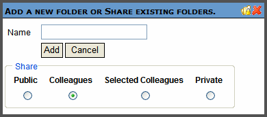
4. Enter a Name for the folder.
5. In the Share area, select with whom you want to share your photos.
|
Photos can be viewed by.. |
|
|
Public |
Anyone who can access your profile |
|
Colleagues |
Only colleagues (either you accepted their invitation, or they accepted yours) |
|
Selected |
Colleagues that you designated as selected. See Also: Designating a Selected Colleague |
|
Private |
Only you |
6. Click Add.
7. When the page refreshes, it opens to the newly added folder.

Editing a Category’s Name
Sometimes, it is necessary to change the name of category. To accomplish this, follow these steps.
1. On the Web site, navigate to a User’s Profile Page > Photo Gallery.
2. Click Edit (
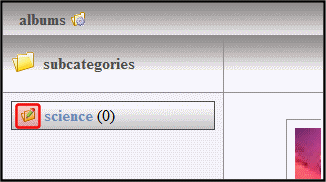
3. The Edit box appears.

4. Change the name of the category.
5. Click Save.
Deleting a Category
A user can delete obsolete categories in his photo gallery. To delete a category, follow these steps.
Note: You can not delete the top-level folder, Albums.
Warning! Deleting a category permanently deletes all photos, as well as its subcategories.
1. On the Web site, navigate to a User’s Profile Page > Photo Gallery.
2. Click Edit (

3. The Edit box appears.

4. Click Delete.
5. A dialog box appears asking you to confirm.
6. Click OK.
Adding Photos to a Photo Gallery
To add a photo to a photo gallery, follow these steps.
1. On the Web site, navigate to a User’s Profile Page > Photo Gallery.
2. Select a category where the photo will be added. If you want to create a new category, see Adding Categories
3. Click Add Photo (
Note: If you see the following error at this point, make sure your server’s clock is set to the correct time.
Error: Object Expected
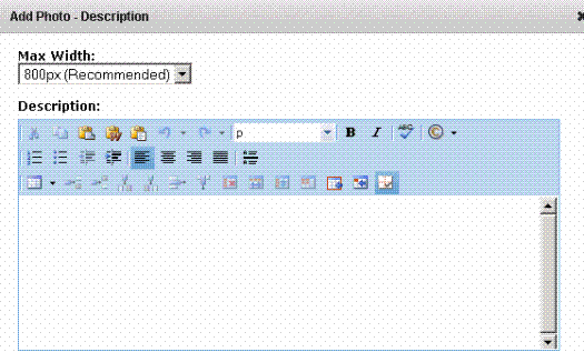
4. The Add Photo box appears
5. In the Photo Data area, enter a Description and Maximum Width.
6. Click Next.
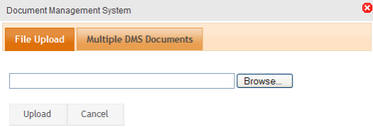
7. The Add Photo dialog appears. Its appearance varies according to your browser, as explained in Adding Documents Using the Add Assets Button.
8. User the Browse or Choose File button to navigate to the photo in your file system. Or, you may be able to click the Drag Drop tab and drop a photo in the Add box.
9. A status box shows the files being uploaded.
10. The page refreshes, and the photo appears in the gallery.
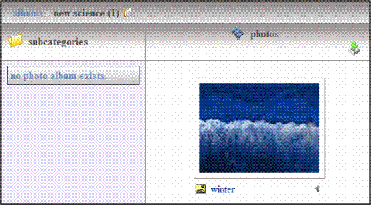
Changing a Photo’s Title or Description
To change a photo’s title or description, follow these steps.
1. On the Web site, navigate to a User’s Profile Page > Photo Gallery.
2. Select the category which contains the photo you want to change.
3. Click the triangle to the right of the photo’s title.
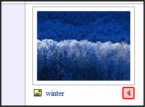
4. From the drop down list, select Edit Properties.
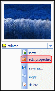
5. Edit the photo’s Title, Description, or both.
6. Click Save.
Moving and Copying Photos
A user can move a photo from one category to another. In addition, you can copy photos to another category. To accomplish either of these actions, follow these steps.
1. On the Web site, navigate to a User’s Profile Page > Photo Gallery.
2. Select the category from which to move or copy the photo.
3. Click the triangle to the right of the photo’s title.

4. From the drop down list, select Copy.
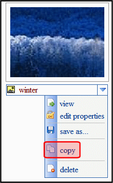
5. Select the category to which the photo will be moved.
6. Click Manage.
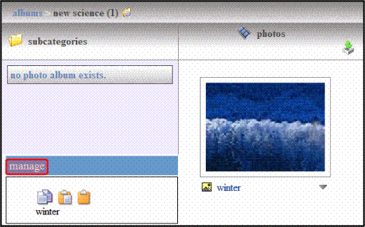
7. Click Move (

8. A dialog box asks you to confirm the action.
9. Click OK.
Deleting a Photo
As photos become obsolete or are no longer wanted, users can delete them. This permanently removes the photo from the user’s photo gallery. To delete a photo, follow these steps.
1. On the Web site, navigate to a User’s Profile Page > Photo Gallery.
2. Select the category which contains the photo you want to delete.
3. Click the triangle to the right of the photo’s title.

4. From the drop down list, select Delete.
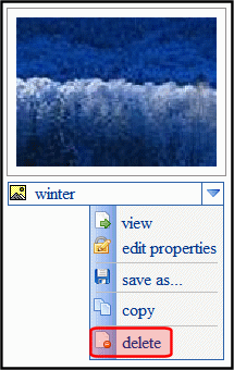
5. A dialog box asks you to confirm.
6. Click OK.
Sharing Photos
The Photo Gallery lets users share photos with their colleagues. Users can share photos with the Public, Colleagues, Selected Colleagues or keep them private. Users apply sharing options to categories, not individual photos. See Also: Share options
To share a category, follow these steps.
1. On the Web site, navigate to a user’s Profile Page > Photo Gallery.
2. Click Manage Folder (
3. The Add box appears.
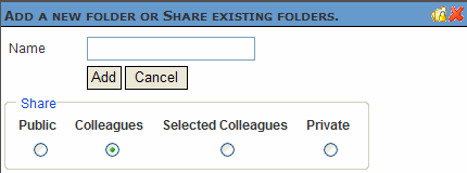
4. Click Share Folder (
5. The Share Workspace box appears.
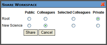
6. Select with whom to share your photos. Share option describes each choice.
7. Click Share.
8. Click close window ( ).
).
Saving a Photo to User’s Local System
Users can save a photo to their computer. This enables the gallery owner to give the photo to other members of the community.
For example, I add a photo of my child to my photo gallery. My parents can then save the photo to their computer and either change it, print it, or upload it to their own photo gallery.
To save a photo to a computer, follow these steps.
1. On the Web site, navigate to a User’s Profile Page > Photo Gallery.
2. Select the category that contains the photo you want to save.
3. Click the triangle to the right of the photo’s title.

4. Select Save As... from the drop down list.
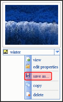
5. A dialog asks you to open or save the file.
6. Click Save.
Allowing Community Group Members to Work with Folders
When you associate this control with a community group, you can allow group members to add, remove and control the sharing of folders in a workspace. Because this feature is implemented on a group by group basis, it is controlled in the Workarea's Edit Community Group screen. See Also: Allowing Community Group Members to Work with Folders
PhotoGallery Server Control Properties
The PhotoGallery server control properties are described in this table.
Note: The following table only lists Ektron-specific properties. It does not describe native .NET properties such as font, height, width and border style. For documentation of these properties, see Visual Studio help.
|
Property |
Description |
Data Type |
|
Authenticated |
Indicates if you are logged in to the CMS Explorer and can use it to browse to Content, Collections, etc.See Also: Working with Ektron CMS400.NET Server Controls |
String |
|
CacheInterval |
Sets the amount of time the server control’s data is cached. The default is 0 (zero). This is the amount of time, in seconds, a control’s data is cached. For example, if you want to cache the data for five minutes, set this property to 300 (three hundred). See Also: Caching with Server Controls. |
Double |
|
DefaultObjectID |
The default object ID for this control to use when there is no matching dynamic parameter value passed. |
Long |
|
DisplayXslt |
Determines how information is displayed on the page. Enter the path to the XSL file. It can be relative or absolute. Warning! If you specify an external file, it is strongly recommended that you do not store this file in your site's Workarea folder. If you store this file in the Workarea folder, the file will be lost when you upgrade. |
String |
|
DoInitFill |
By default, Fill occurs during the Page_Init event. Set to false if you want to postpone the fill-action until later. In this case, FIll is automatically called during the Page Render event. You might do this if you need to set or change a property on the control in codebehind and have it render with your changes shown. |
Boolean |
|
DynamicContentBoxHeight |
The height of the dynamic content box in pixels. |
Integer |
|
DynamicContentBoxWidth |
The Width of the dynamic content box in pixels. |
Integer |
|
DynamicContentTemplate |
The template to use when displaying dynamic content. Leave blank to use the dynamic box. |
String |
|
Dynamic Parameter |
Gets or sets the QueryString parameter to read a object ID dynamically. To use the default object ID, leave blank. |
String |
|
EnablePaging |
This property, in conjunction with the MaxResults property, lets site visitors view an unlimited number of document items while controlling the amount of screen space. To accomplish this, the display is limited to the number set in the MaxResults property. If you set this property to true, and the number of items exceeds the MaxResults number, navigation aids appear below the last item. |
Boolean |
|
Hide |
Used to hide output of the control in design time and run time. True = Hide control False = Display control |
Boolean |
|
IncludeIcon |
Choose whether to display icons next to the navigation list’s links.
True = Show icons False = Hide icons |
Boolean |
|
ItemSortOrder |
Specify the sort order of results. Choices are: taxonomy_item_display_order - the order of taxonomy items as set in the Workarea. For additional information, see Change Order of Content Assigned to a Taxonomy/Category. content_title - photos listed in alphabetical order by title date_created - photos listed in chronological order by date created last_edit_date - photos listed in chronological order by date created To specify the direction of the items, use the SortDirection property. |
|
|
Language |
Set a language for viewing the server control. This property shows results in design-time (in Visual Studio) and at run-time (in a browser). |
Integer |
|
LinkTarget |
Determines the type of window that appears on this Web form when a user clicks an item in the dynamic content box. The default is _self. _Self - opens in same window _Top - opens in parent window _Blank - opens in new window _Parent - opens in the parent frame |
String |
|
MarkupLanguage |
Identify the template markup file that controls the display of the server control. For example, mymarkup.ekml. If the *.ekml file is located in the same folder as the Web form containing the server control, just enter its name. Otherwise, the path to the file can be relative or absolute. See Also: Controlling Output with Ektron Markup Language |
String |
|
MaxResults |
The Maximum number of items to fetch. 0 (zero) = unlimited. |
Integer |
|
ObjectType |
The type of object to which this control is assigned. Choices are: User - this control is assigned to an individual. Group - this control is assigned to a community group. |
String |
|
ShowCount |
Indicates if an integer representing the number of taxonomy items in the category appears next to each category when displayed on the Web site. The default is False. True - Show taxonomy items number next to category. False - Do not show taxonomy items number next to category. |
Boolean |
|
SortDirection |
Select the direction of the itemSortOrder property. Choose Ascending or Descending. |
String |
|
Stylesheet |
Specify the path to a style sheet for use with the server control. The location can be relative or absolute. Leave blank to use the default style sheet. Warning! If you enter a valid EkML file at the MarkupLanguage property, the Stylesheet property is ignored. |
String |
|
TaxonomyCols |
Enter the number of columns in which this taxonomy/category appear on the page. |
Integer |
|
TaxonomyItemCols |
Enter the number of columns in which the taxonomy item appear on the page. |
Integer |
|
WrapTag |
Allows a developer to specify a server control’s tag. The default is Span. Span - The <span> tag is used to designate an inline portion of an HTML document as a span element. Div - The <div> tag is used when you want to apply attributes to a block of code. Custom - Allows you to use a custom tag. |
String |


